Take note that all functions listed below are available to call using the global object Theme. In addition, this module is only available within the editor and cannot be called in the client or in a published project.
| Name | Description |
ButtonNew | Create a new themed button. |
Declaration Button *ButtonNew( const char *s, Icon *icon, Widget *parent ) Parameters
s: Specify the text of the button.icon: Icon to use on the left side of the button.parent: Specify the parent Widget the Button should be attached to.
Return Value
Reference to the newly created Button Widget.
|
CheckBoxNew | Create a new themed checkbox. |
Declaration Button *CheckBoxNew( const char *s, int value, Widget *parent ) Parameters
s: Specify the label located on the right side of the checkbox.value: Specify the value that should be toggled on/off based on the checkbox state.parent: Parent Widget the checkbox should be attached to.
Return Value
Reference to the newly created Button Widget.
|
ColorBarNew | Creates a color bar that allows you to display and pick color. |
Declaration Picture *ColorBarNew( Widget *parent ) Parameters
parent: Specify the parent Widget the Button should be attached to.
Return Value
Reference to the newly created Picture widget that will act as a color bar.
|
CurveBarNew | Creates curve bar allowing you to visualize and edit a specific Curve. |
Declaration Widget *CurveBarNew( Widget *parent, Curve *curve, const char *curve_code, bool normalize ) Parameters
s: Specify the label located on the right side of the checkbox.value: Specify the value that should be toggled on/off based on the checkbox state.parent: Parent Widget the checkbox should be attached to.
Return Value
Reference to the newly created Button Widget.
|
DialogNew | Create a new blank dialog. |
Declaration Widget *DialogNew( const char *title, const ivec2 size, Icon *icon ) Parameters
title: Title to use at the top left of the dialog.size: Width and height of the dialog in pixel.icon: Icon to use near the dialog's title text.
Return Value
Reference of the root Widget of the dialog.
|
DialogLabelNew | Create a new Label that fit the look and feel of a dialog center area. |
Declaration Label *DialogLabelNew( unsigned int units, const char *s, Widget *parent ) Parameters
units: Force the Label to be a certain unit size preventing it to be resized.s: The Label string.parent: Parent Widget where the new Label should be attached to.
Return Value
Reference to the new Label.
- Note
1 Unit = ThemeUtilsGetWidgetSize()
|
GridNew | Create a table attached to a Panel where widgets can be placed into each cell. |
Declaration Grid *GridNew( const char *s, Panel *parent ) Parameters
s: Title of the Grid.parent: Reference to an existing Panel Widget where to attach the Grid to.
Return Value
Reference to the new Grid.
|
GroupNew | Create a another type of table that regroup multiple Widget together. |
Declaration Grid *GroupNew( Grid *grid ) Parameters
grid: Reference to the Grid the group should be attached to.
Return Value
Reference to a Grid Widget.
|
| | Create a horizontal header (also used as footer). |
LabelNew | Create a new Label to display static text. |
Declaration Label *LabelNew( const char *s, Icon *icon, Widget *parent ) Parameters
s: Text to display.icon: An optional icon.parent: Specify to wich Widget the Label should be attached to.
Return Value
Reference to the new Label.
|
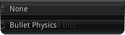
ListNew | Create a list view generally used to create popup, menu, drop down list etc... |
Declaration Panel *ListNew( Widget *hanger, unsigned char type, unsigned char horizontal, unsigned char vertical, unsigned short priority, PanelType scroll_type ) Parameters
hanger: Specify the Widget reference where the list should be hanging from.type: Determine the direction of the list.horizontal: Specify the horizontal alignment of the list.vertical: Specify the vertical alignment relative to the hanger.priority: Specify the z-depth drawing priority of the list (the higher the top most).scroll_type: Specify the PanelType which defines the scrolling direction of the list.
List Type
m: Menul: Listp: Popupo: Outline
Horizontal Alignment
l: Leftr: Rightc: Centera: Aligned
Vertical Alignment
h: Hanger Alignedp: Hanger Parent Downd: Hanger Downu: Hanger Up
Return Value
Reference to the new Panel.
|
ListItemNew | Create a new list item bar. |
Declaration Button *ListItemNew( const char *s, Icon *icon, int value, Widget *parent ) Parameters
s: Specify the test of the list item.icon: An optional icon.value: Value of the item on the list.parent: Reference to the parent list the item should be inserted.
Return Value
Reference to the new Button Widget that will be use as list item.
|
| | Create a new menu bar. |
| | Create a new menu item. |
PanelNew | Create a new panel to either list item vertically or horizontally. |
Declaration Panel *PanelNew( Widget *parent ) Parameters
parent: Determine where to place the new Panel.
Return Value
Reference to a new Panel.
- Note
- Optionally an indicator can be placed which will highligth when elements contained in the Panel or out of the view.
|
PictureNew | Create a new Picture to place an Icon. |
Declaration Picture *PictureNew( Icon *icon, Widget *parent ) Parameters
Return Value
Reference to a new Picture Widget.
|
PictureButtonNew | Create a simple Button with a Picture at the center. |
Declaration Button *PictureButtonNew( Icon *icon, Widget *parent ) Parameters
Return Value
Reference to a new Button Widget.
|
RadioButtonNew | Create a new radio Button. |
Declaration Button *RadioButtonNew( const char *s, unsigned char group, Widget *parent ) Parameters
s: The text to use for the Label located on the right side of the radio button.group: Specify the radio button group number.parent: Specify the parent of the new Button.
Return Value
Reference to a newly created radio Button.
|
ScrollerNew | Create a new Scroller (aka. slider) control. |
Declaration Scroller *ScrollerNew( const char *format, unsigned int max_char, const vec2 range, Widget *parent ) Parameters
format: The string format to apply to the Scroller text input.max_char: Determine the maximum amount of characters that the input can take.range: Specify the lowest and highest value of the Scroller.parent: Specify the parent Widget of the Scroller.
Return Value
Reference to a Scroller freshly created.
|
SeparatorNew | Create a simple separator; a delimitation that can be placed in between two sections etc... |
Declaration Widget *SeparatorNew( ScrollerType type, Widget *parent ) Parameters
type: Specify the direction of the delimiter.parent: Specify the parent Widget where the separator should be placed.
Return Value
Reference the separator Widget.
|
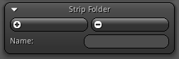
SlotBoxNew | Create a new slot box which is a retractable grid that can be use as a Widget container. |
Declaration Grid *SlotBoxNew( const char *s, Icon *icon, Grid *grid ) Parameters
s: Title of the slot box.icon: The Icon to use with the slotbox.grid: The parent Grid where the slotbox should be placed.
Return Value
Reference to the new slot box Grid.
|
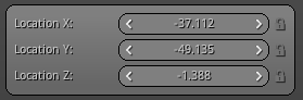
SpinnerNew | Special type of textbox that is designed to handle numbers. |
Declaration TextBox *SpinnerNew( const char *format, unsigned int max_char, const vec2 range, Widget *parent ) Parameters
format: Specify the formatting to use for the number that the spinner will handle.max_char: Maximum number of character input.range: Specify the lowest and highest value of the spinner.parent: Specify the parent Widget where the spinner should be placed.
Return Value
Reference to the new spinner TextBox.
|
SplitterNew | Create a local delimitation that can be resized by the user dy dragging the middle handle. |
Declaration Splitter *SplitterNew( const quad bounds, SplitterType type, bool invert, Widget *parent ) Parameters
bounds: Size of the splitter area.type: The SplitterType to use to delimitate the cells.invert: Invert the dominant cell from left to right or up to down. parent: Parent Widget where the Splitter should be placed.
Return Value
Reference to the new slot box Grid.
- Note
- If the total area occupied by the Splitter is too small the cell that is designated as the main areas will retract automatically.
|
StickyNew | Create a new sticky; usually used to display help hint for a control. |
Declaration Grid *StickyNew( Widget *hanger, int level, const vec2 offset, ScrollerType alignment ) Parameters
hanger: Specify the Widget that the sticky should be following.level: How many parent Widget down the sticky should be aligned with.offset: Specify an offset size in pixel.alignment: Specify the ScrollerType which represent the way the sticky will follow its hanger.
Return Value
Reference to the Grid of the new sticky.
|
TextAreaNew | Create a text area that can handle long Stream of text. |
Declaration TextArea *TextAreaNew( Widget *parent ) Parameters
Return Value
Reference to the newly created TextArea.
|
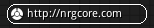
TextBoxNew | Create a themed TextBox. |
Declaration TextBox *TextBoxNew( const char *s, unsigned int max_char, Icon *icon_left, Icon *icon_right, Widget *parent ) Parameters
s: String to use as the default TextBox value.max_char: Maximum number of characters allowed in the TextBox.icon_left: Reference to the Icon to use on the left side of the TextBox (nil if none).icon_right: Reference to the Icon to use on the right side of the TextBox (nil if none).parent: Specify the parent Widget where the TextBox should be placed.
Return Value
Reference to the new TextBox Widget.
|
ToolButtonNew | Create a new tool Button; which is a simple Button with an icon that act as a switch (pressed/un-pressed). |
Declaration Button *ToolButtonNew( Icon *icon, Widget *parent ) Parameters
icon: The Icon to use for the toolbutton.parent: Parent Widget where the Button is attached.
Return Value
Reference to the newly created Button.
|
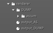
TreeBoxNew | Create a new treebox (either single or a folder) entry part of a treeview architecture. |
Declaration Grid *TreeBoxNew( const char *s, Icon *icon, Widget *parent, bool is_item ) Parameters
s: Title to use for the new treebox.icon: Reference to an existing Icon used to identify the content of the box.parent: Specifyicon_right: Reference to the Icon to use on the right side of the TextBox (nil if none).parent: Specify the parent Widget of the treebox (basically a treeview).is_item: Specify if the treebox is a single item or a root/folder.
Return Value
Reference to the new Grid that will act as a treebox.
|
TreeViewNew | Create a new treebox which provide functionalities to maintain a hierarchy of multiple levels. |
Declaration Panel *TreeViewNew( Widget *parent ) Parameters
parent: Specify the parent where the treeview should be located.
Return Value
Reference to the new Panel that will consists of the treeview.
|
ScrollerFormat | Helper function clamp and format a value based on a Scroller settings. |
Declaration float ScrollerFormat( Scroller *scroller, float value ) Parameters
scroller: Reference to a valid Scroller.value: The value to test against the Scroller format and range.
Return Value
The formatted value.
|
SpinnerFormat | Helper function clamp and format a value based on a spinner settings. |
Declaration float SpinnerFormat( TextBox *textbox, float value ) Parameters
textbox: Reference to a valid TextBox used as a spinner.value: The value to test against the spinner format and range.
Return Value
The formatted value.
|
PanelAddIndicator | Add an indicator to an existing Panel allowing you to visualize if some content is out of the Panel bounds. |
Declaration void PanelAddIndicator( Panel *panel ) Parameters
panel: Reference to a valid Panel.
|
TreeBoxAlign | Function that recursively align all parent of a Grid that is used as treebox. |
Declaration void TreeBoxAlign( Grid *grid ) Parameters
grid: Reference to a valid Grid used as a treebox.
|
TreeBoxSetAsSingle | Set a specific treebox to be a leaf of the tree. |
Declaration void TreeBoxSetAsSingle( Grid *grid, const ivec2 spacing ) Parameters
grid: Reference to a Grid that is used as a treebox.spacing: Desired amount of spacing to use to keep the leaf aligned with the rest of the tree.
|
TreeViewSelection | Function that recursively search for a specific sub-string starting from an specific treebox. |
Declaration void TreeViewSelection( Widget *root, const char *mark ) Parameters
root: Root treebox to start the search.mark: The string to search and mark as selection.
|
UtilsAlignAll | Helper that recursively align all parent of a Widget. |
Declaration void UtilsAlignAll( Widget *widget ) Parameters
widget: Reference to a valid Widget.
- Note
- Only parents that can be aligned such a Grid or Panel will be processed by the function.
|
GetIcon | Retrieve an existing Icon using its name as key. |
Declaration Icon *GetIcon( const char *name ) Parameters
name: Name of the Icon to retrieve.
Available Icons
|
GetPanelBase | Recursively search the parents of a widget until a Panel is found. |
Declaration Widget *GetPanelBase( Widget *widget ) Parameters
widget: Reference to a valid Widget.
Return Value
nil if no Panel can be found; else return the Widget reference.
|
GetGridBase | Recursively search the parents of a widget until a Grid is found. |
Declaration Widget *GetGridBase( Widget *widget ) Parameters
widget: Reference to a valid Widget.
Return Value
nil if no Grid can be found; else return the Widget reference.
|
GetBase | Recursively search the parents until a Widget of the type kBase is found. |
Declaration Widget *GetBase( Widget *widget ) Parameters
widget: Reference to a valid Widget.
Return Value
nil if no Widget of the type kBase can be found; else return the Widget reference.
|
GetUserBase | Recursively search the parents until a Widget of the type kUser is found. |
Declaration Widget *GetUserBase( Widget *widget ) Parameters
widget: Reference to a valid Widget.
Return Value
nil if no Widget of the type kUser can be found; else return the Widget reference.
|
GetSplitterBase | Recursively search the parents of a widget until a Splitter is found. |
Declaration Widget *GetSplitterBase( Widget *widget ) Parameters
widget: Reference to a valid Widget.
Return Value
nil if no Splitter can be found; else return the Widget reference.
|
GetAreaBase | Recursively search the parents of a widget until a Widget of the type kArea is found. |
Declaration Widget *GetAreaBase( Widget *widget ) Parameters
widget: Reference to a valid Widget.
Return Value
nil if no kArea Widget can be found; else return the Widget reference.
|
GetContent | Recursively try to find the content Widget of a dialog. |
Declaration Widget *GetContent( Widget *widget ) Parameters
widget: Reference to a valid Widget.
Return Value
nil if no Widget content have been found; else return the Widget reference.
|
GetHanger | Retrieve the hanger reference of the active Widget. |
Declaration Widget *GetHanger( void ) Return Value
nil if the Widget does not have any hanger property; else return the Widget reference that is used as hanger.
|
GetRootHanger | Recursively try to find the hanger of the active Widget. |
Declaration Widget *GetRootHanger( void ) Return Value
nil if no hanger can be found; else return the hanger Widget reference.
|
GetDefaultWidgetHeight | Helper that returns the default height of a Widget based on the current Font used by the IDE. |
Declaration int GetDefaultWidgetHeight( void ) Return Value
The default height used by Widget in pixels.
|
GetWidgetSize | Function to retrieve the size in pixels for a specific number of units. |
Declaration int GetWidgetSize( unsigned char unit ) Parameters
unit: Specify the number of unit(s).
Return Value
The size in pixels for the number of units received in parameter.
|
AdjustPriority | Automatically adjust the priority of a Widget based on its parent(s) or hanger. |
Declaration unsigned short AdjustPriority( Widget *widget ) Parameters
widget: Reference to the Widget to adjust.
Return Value
Return the priority that have been assigned to the Widget.
|
ImageLoad | Utility function that load an image from disk and store the texels into a Texmap. |
Declaration bool ImageLoad( const char *filename, Texmap *texmap ) Parameters
filename: Path of the image to load.texmap: Reference to the Texmap that should be used to store that data.
Return Value
true on success; else return false if either the file cannot be found or if the format is not supported.
- Note
- The supported image format are:
.jpeg, .png, .bmp, .psd, .gif, .hdr, .ext, .pic, .pgm, .pnm and .ies.
|
GenerateSignedDistanceFields | Generate signed distance fields for the active texel data. |
Declaration bool GenerateSignedDistanceFields( const float normal_factor ) Parameters
normal_factor: Normalized value from the range of 0 to 1 representing the normal distance factor to use. As a rule of thumb a value around 0.1 gives good overall results.
Return Value
true on success; false if one of the failure case listed below occurs.
- No texel array is available (
byte_array is equal to nil).
- The
byte size if greater than 4, or of the type multisamples.
- The
depth of the Texmap is greater than 1 (3D texture of 2D array textures are not supported).
- The Texmap data contains 16 bits values (
f16bits).
- The Texmap data are converted to floating points (
fFloat).
|
DialogClose | Manually close an existing dialog. |
Declaration bool DialogClose( Widget *dialog ) Parameters
dialog: Reference to an existing dialog Widget.
Return Value
true on success; else return false if either the reference is nil or if it is not a dialog.
|
A structure that contains the information about a specific icon located in the IDE icon atlas.